Expert-built system behind seamless, resilient payments in high-risk industries.
VIALET performs under pressure – for businesses where every transaction must work. We deliver seamless financial flows through adaptive onboarding, robust infrastructure, and 24/7 expert support. In high-risk environments, trust is built one transaction at a time – and VIALET is the system behind seamless.
ROLE
Engineers of Trust
VALUE PROPOSITION
System Behind Seamless
A logotype is only a small part of the overall identity, but it is the most recognisable and tangible expression of a brand – a mark of expertise, reliability, and trust. It should always be used with precision and consistency to reflect the integrity behind our system.
Our logotype captures the essence of who we are – engineers of trust. Expertly crafted, it represents the system behind seamless: effortless collaboration, high-performing integrations, and expert-built solutions that work together flawlessly.
The following sections outline how our logo should – and should not – be used within the new visual identity system.

Our logo is always used in Black (#000000) colour. If that is not possible – you can exceptionally use logo in White (#ffffff) colour.
Black Logotype
This version of the logotype is designed for use on white, light-colored, or brand primary and secondary color backgrounds. It represents the main color version of the logo and serves as the primary variant.
White Logotype
This version of the logotype is used on black or other dark-coloured backgrounds.
The short version of the logo (symbol) is intended to represent VIALET in smaller formats or where a full version of the logo is not possible, e.g. favicon or app icon.
Black Symbol
This version of the symbol is used on white or other light-coloured backgrounds.
White Symbol
This version of the symbol is used on black or other dark-coloured backgrounds.
To protect the strength and integrity of our logo, a clear space area, free of competing visual elements should be maintained. When applying a logotype to a particular layout be aware of its size – when the logo is smaller ensure a bigger safety zone, if the logo is bigger – the safety zone can be smaller.
To ensure its legibility in print or digital formats, the logo shouldn’t be smaller than its smallest possible size. Logo minimum sizes for print and digital media specified below.
-
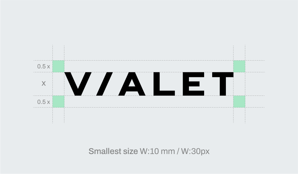 Logo
Logo -
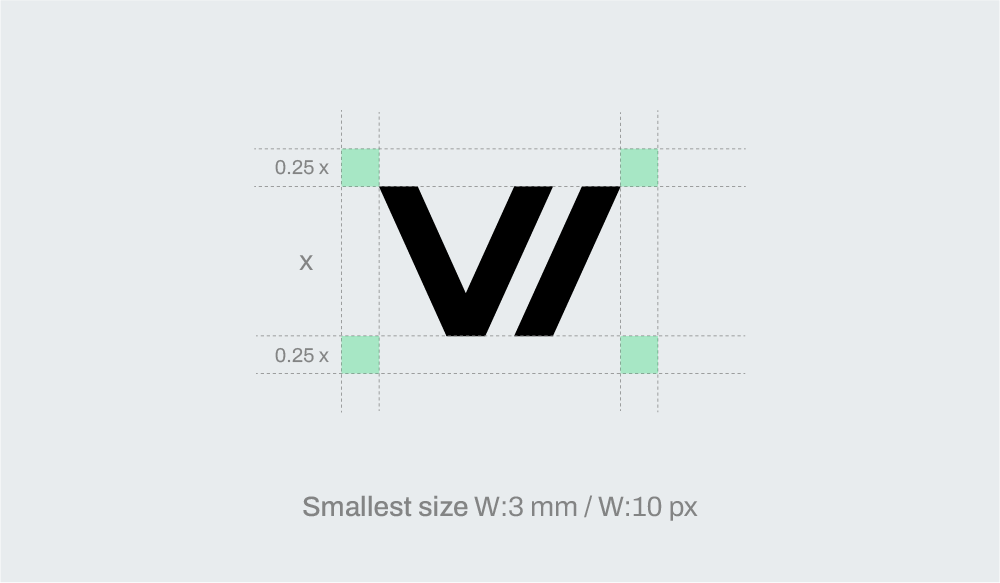 Symbol
Always use a 0-degree angle. / Always use correct proportions of the logo. / Always leave the logo some space to breathe. / Always use the correct logo version on white or dark backgrounds. / Always ensure legibility when using logo on photos.
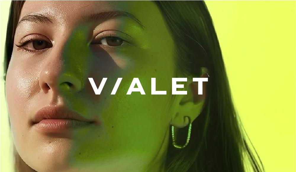
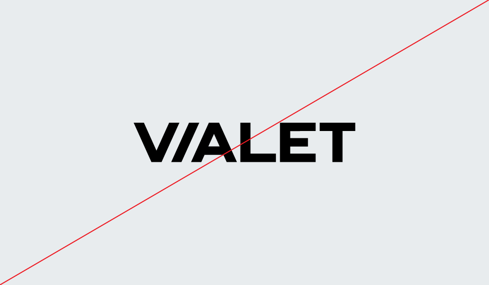
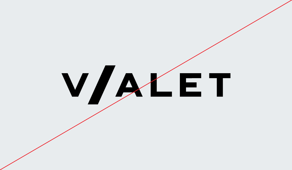
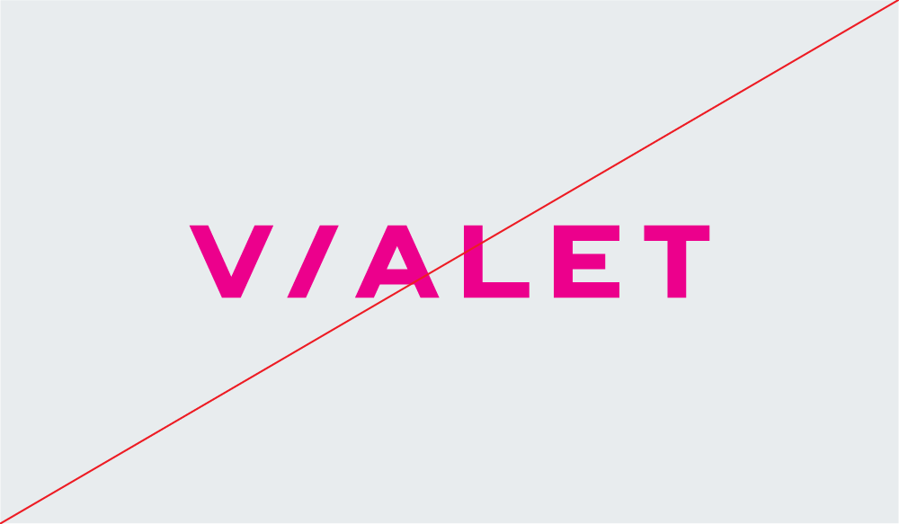
Do not rearrange the logo. / Do not alter the proportions of the logo. / Do not use a color which is not the brand colour. / Do not use the smaller logo than it’s minimum size. / Do not superimpose the logo on any image or background that makes it hard to see.
As VIALET operates across diverse digital and communication touchpoints, a clear and consistent colour palette is essential to ensure brand recognisability and visual harmony across all platforms.
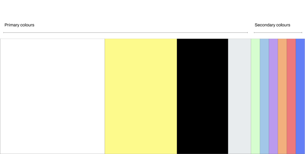
Our brand colours are divided into primary and secondary categories, each carrying a distinct meaning and functional role within the visual system.
White serves as the foundation – a universal base representing openness and clarity. Yellow, symbolising light, acts as the main accent colour within our visual language. It drives gradients, light transitions, and reflections inspired by the prism concept, bringing energy and illumination to the brand. Grey functions as a technical supporting colour, providing balance and neutrality, while Black is reserved for text, icons, and the logo to ensure clarity and contrast.
The secondary palette consists of prism-inspired hues, used across illustrations, graphics, and accents. These colours support the primary palette while adding depth and vibrancy.
While yellow remains the primary accent and driver of our visual identity, future or project-specific adaptations may explore alternative accent colours drawn from the secondary palette – ensuring flexibility while preserving the core principles of light and seamless transformation.
-
#ffffffWhiteRGB: 255, 255, 255CMYK: 0, 0, 0, 0Pantone: White C
-
#fdfa8cYellowRGB: 253, 250, 140CMYK: 4, 0, 63, 0Pantone: 100 C
-
#000000BlackRGB: 0, 0, 0CMYK: 0, 0, 0, 100Pantone: Black 6 C
-
#e8eceeGrayRGB: 232, 236, 238CMYK: 8, 4, 4, 0Pantone: 649 C
Green
RGB: 214, 253, 207
CMYK: 18, 0, 28, 0
Pantone: 352 C
Light Blue
RGB: 162, 199, 232
CMYK: 38, 9, 0, 0
Pantone: 291 C
Red
RGB: 237, 121, 124
CMYK: 0, 71, 40, 0
Pantone: 2031 C
Orange
RGB: 242, 175, 125
CMYK: 0, 39, 58, 0
Pantone: 156 C
Dark Blue
RGB: 100, 127, 246
CMYK: 67, 52, 0, 0
Pantone: 2727 C
Violet
RGB: 186, 154, 239
CMYK: 29, 41, 0, 0
Pantone: 2645 C
Our primary typeface – Archivo – is a grotesque sans serif chosen for its geometric simplicity, clarity, and versatility. Like a prism, it balances precision and lightness, combining technical structure with a human touch.
When Archivo cannot be used – such as in emails or open Word documents – the secondary typeface Arial should be applied. Read more about secondary typeface pairings in the next section.
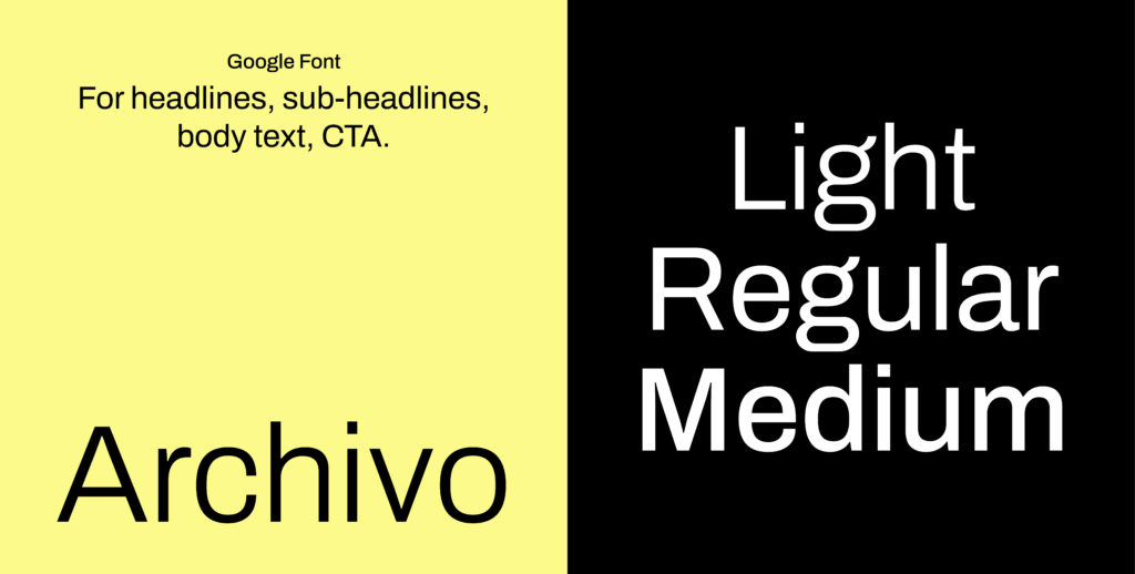
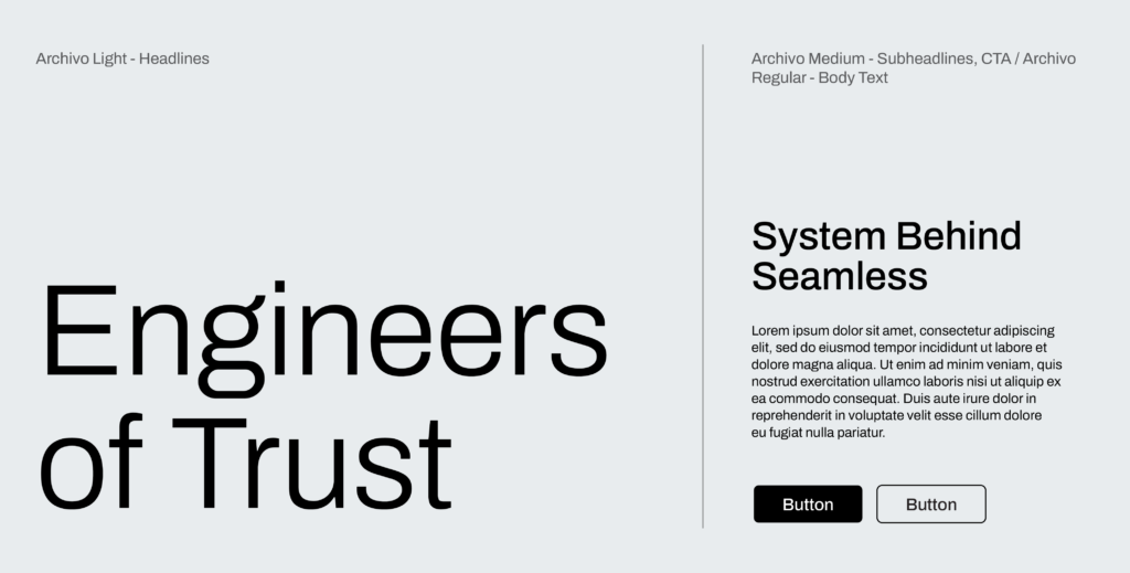
Archivo Light is used for headings, giving a refined and spacious appearance. Archivo Medium is applied to subheadings and call-to-action elements, ensuring clear hierarchy and visual impact, while Archivo Regular is used for body text to maintain readability and consistency across all applications.
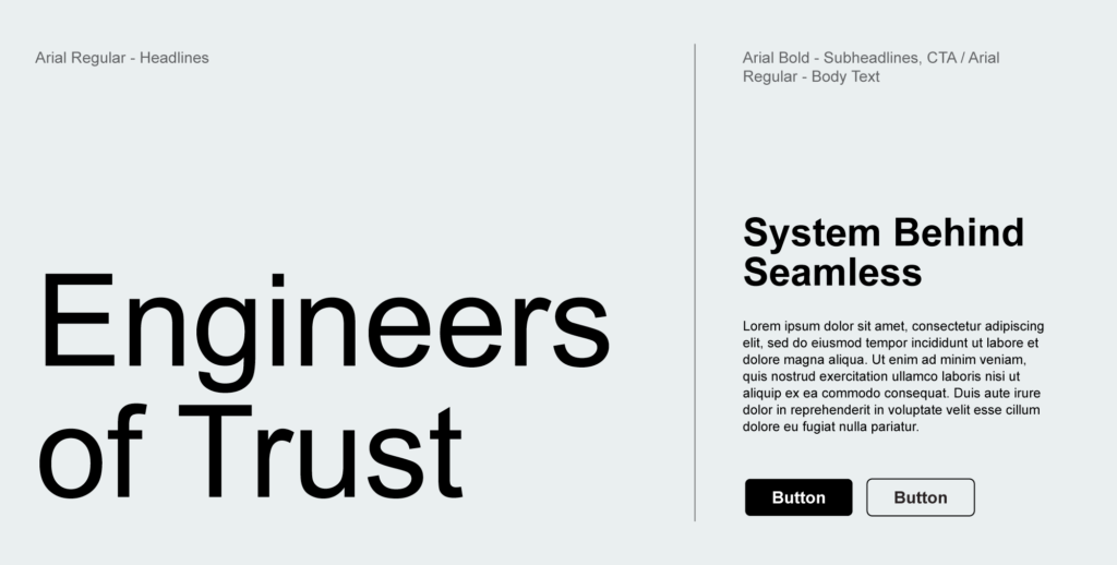
Arial is a secondary typeface and is used in exceptional cases only. This typeface is installed on all computers and should be used in Word, Excel and email signature. This typeface is never used in external applications such as posters, merchandising, website, etc.
For the headings we use Arial Regular font, for the subheadings and CTA elements – Arial Bold and for the body texts – Arial Regular.
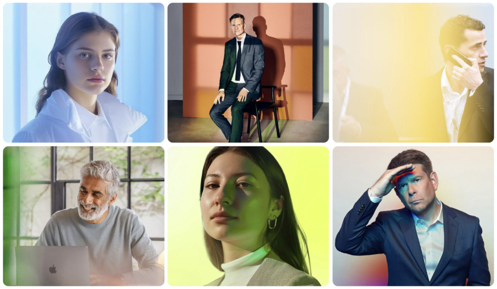
Employee photography in VIALET’S communication should subtly reference the prism concept. For employee portraits, this is achieved through gradient backgrounds, gentle light reflections, and refracted color effects that create a glowing sense of space around the subject. These portraits balance professionalism with warmth, highlighting the human side of expertise.
Lifestyle photography captures natural, reportage-style moments with soft focus, playful light, and movement. When a more spontaneous and authentic expression is desired, a natural, lifestyle-oriented approach can be used instead.
To ensure consistent representation of our brand, new employees who have not yet participated in an official company photoshoot can use the temporary profile photo template.
By placing a personal photo with a white background into the provided template, employees can create a branded version of their portrait for use on LinkedIn or other professional platforms.
This serves as a temporary solution until the official company photoshoot is completed.
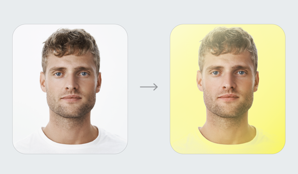
– Open the file in Photoshop.
– Double-click on the layer named [Your photo here].
– Drag and drop your photo into the new window and adjust the crop as needed.
– Save the changes — press Cmd + S on Mac or Ctrl + S on Windows.
– Go back to the main template window and export your branded image.
Note: The blending filter works best when your photo background is completely white. Please upload photos with a clean white background for the best result.
-
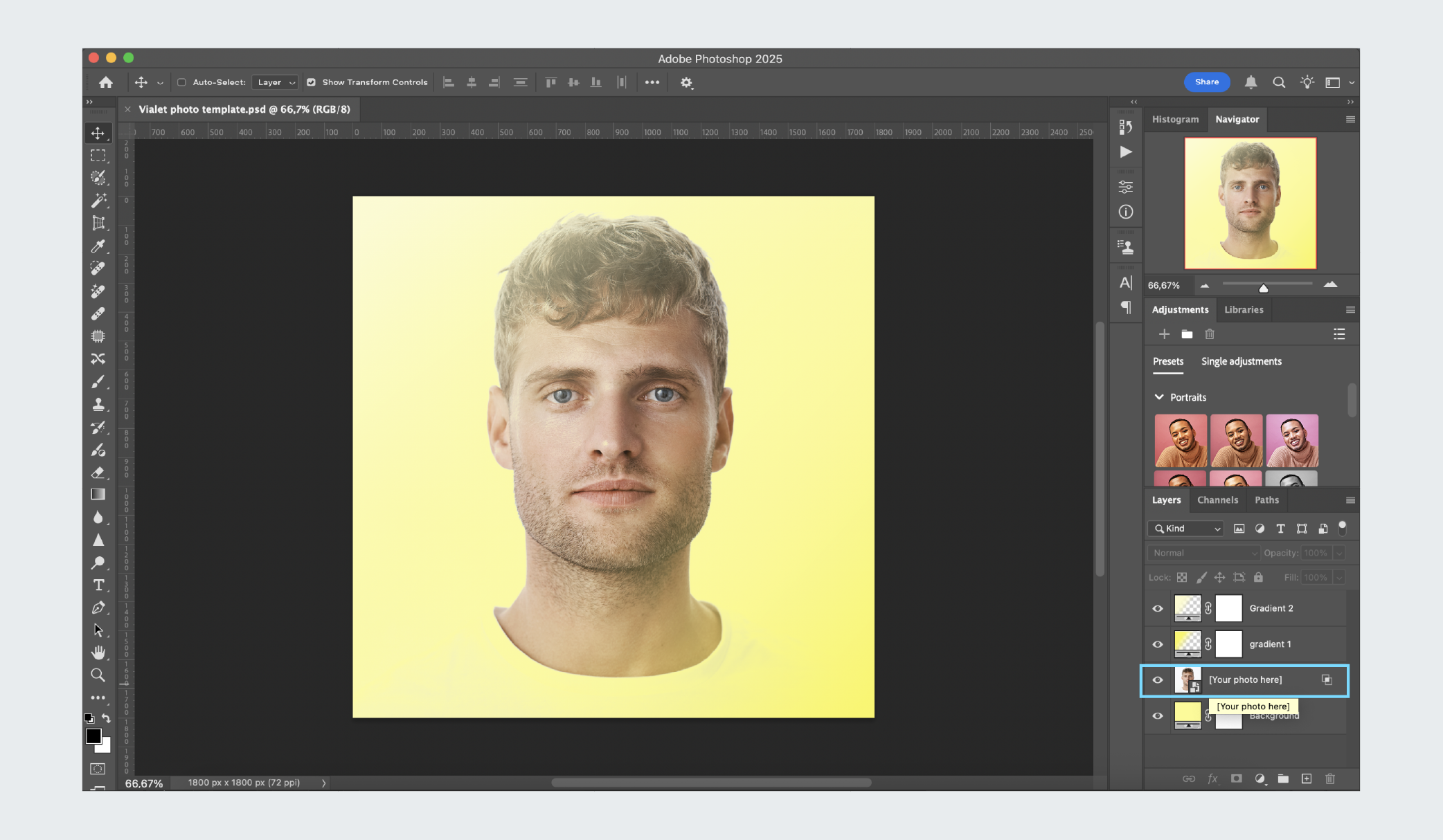 Open the file in Photoshop. Double-click on the layer named [Your photo here].
 -
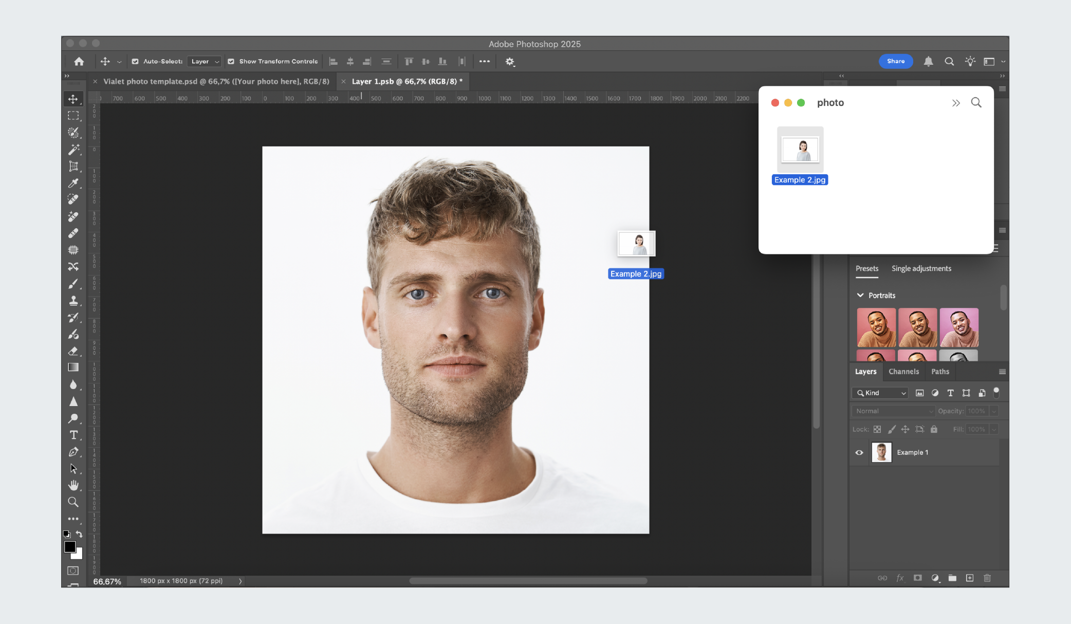 Drag and drop your photo into the new window.
 -
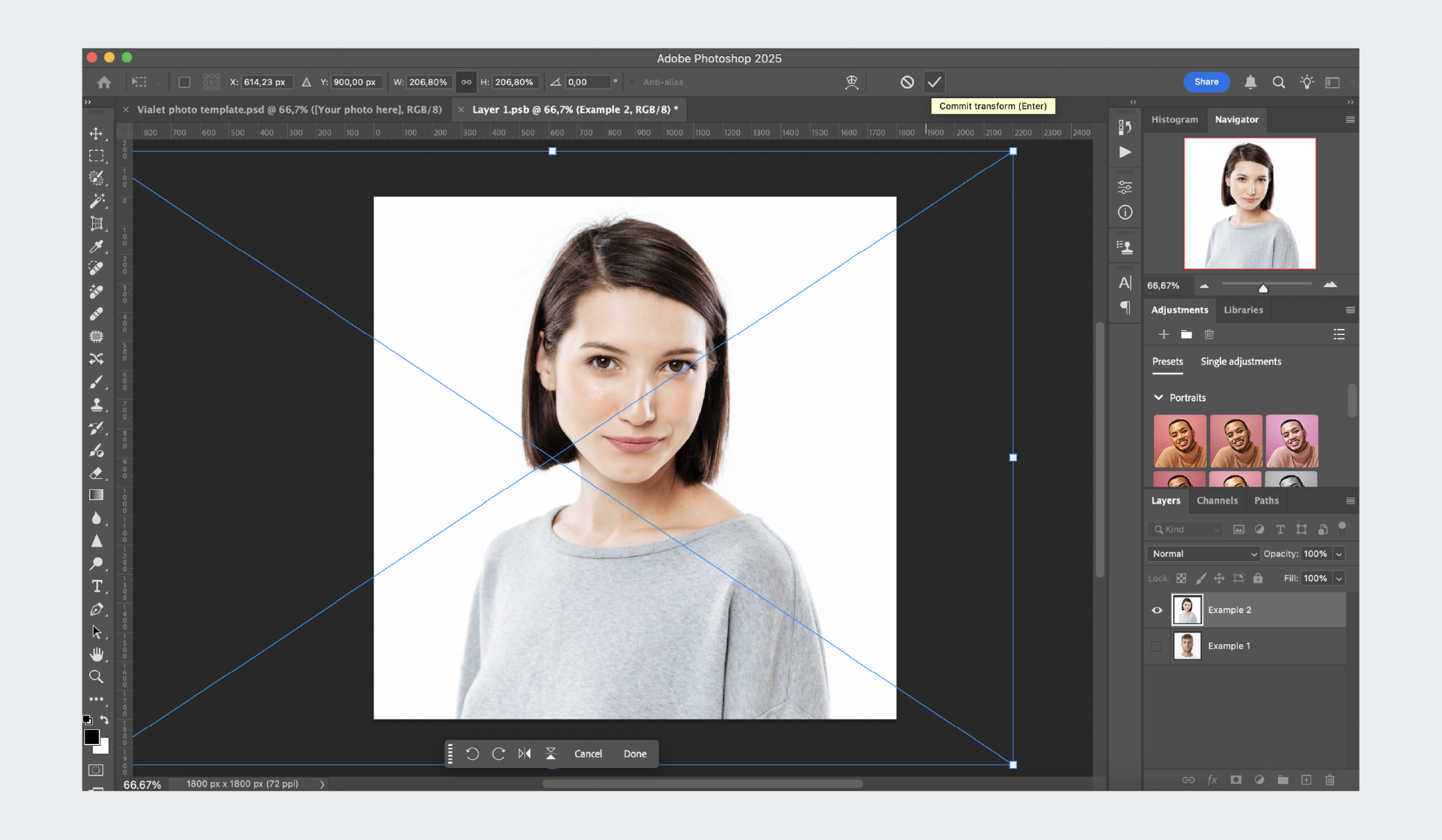 Adjust the crop as needed & click enter. Save the changes — press Cmd + S on Mac or Ctrl + S on Windows.
 -
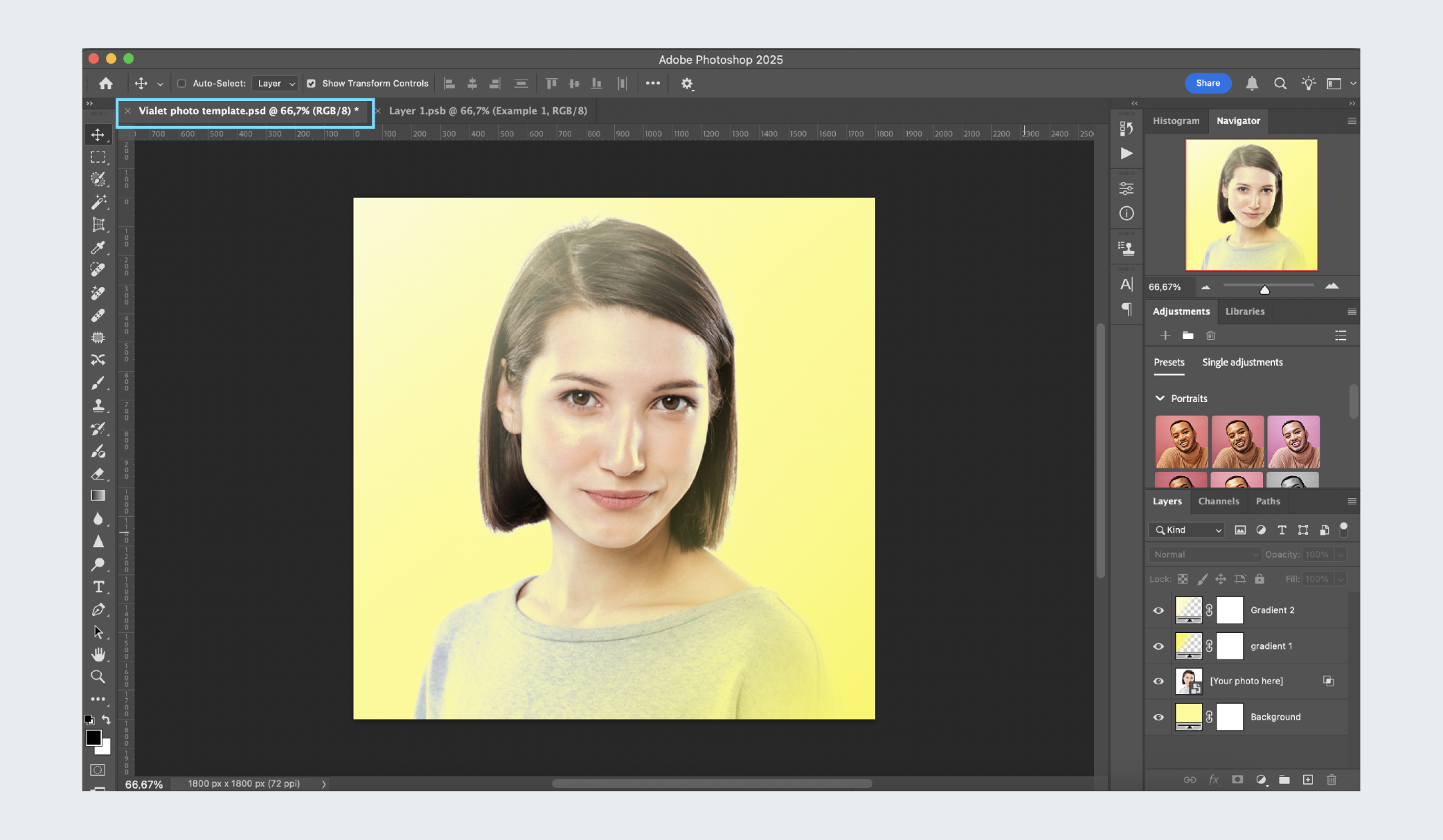 Go back to the main template window and export your branded image.
– After placing your image and returning to the main template window, select your photo layer.
– Click Remove Background to automatically clear most of the background.
-
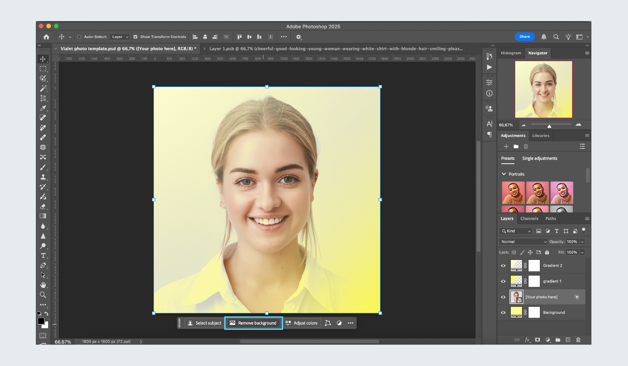 With the photo layer selected, click Remove Background.
 -
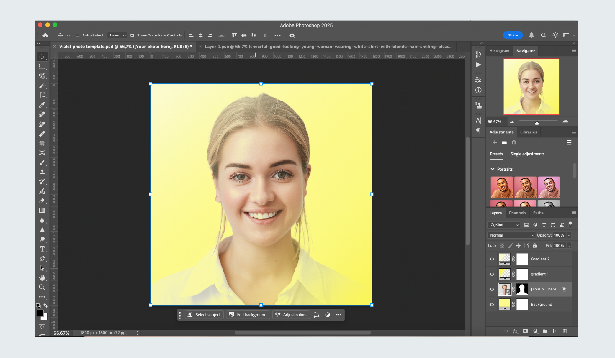 This helps fix cases where the image background is not perfectly white and some areas remain visible.
– Click once on the [Your photo here] layer.
– Open Blending Options.
– At the bottom, find the Blend If section.
– Under This Layer, move the right slider (currently set around 209) to fine-tune how much of the white background disappears.
– To make smoother transitions, hold Option (Mac) or Alt (Windows) while dragging the slider.
-
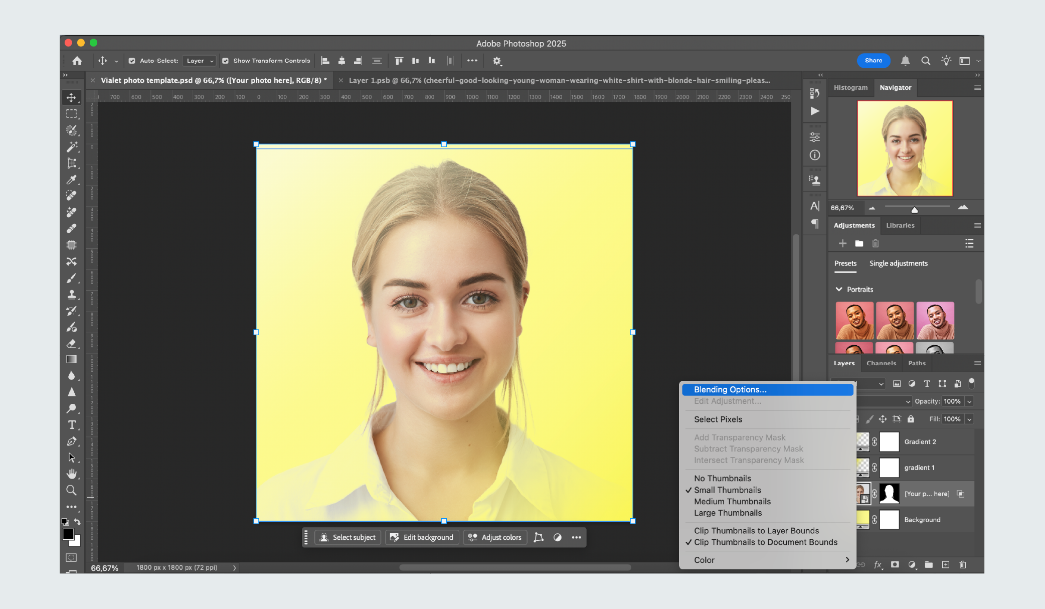 Select the [Your photo here] layer, open Blending Options.
 -
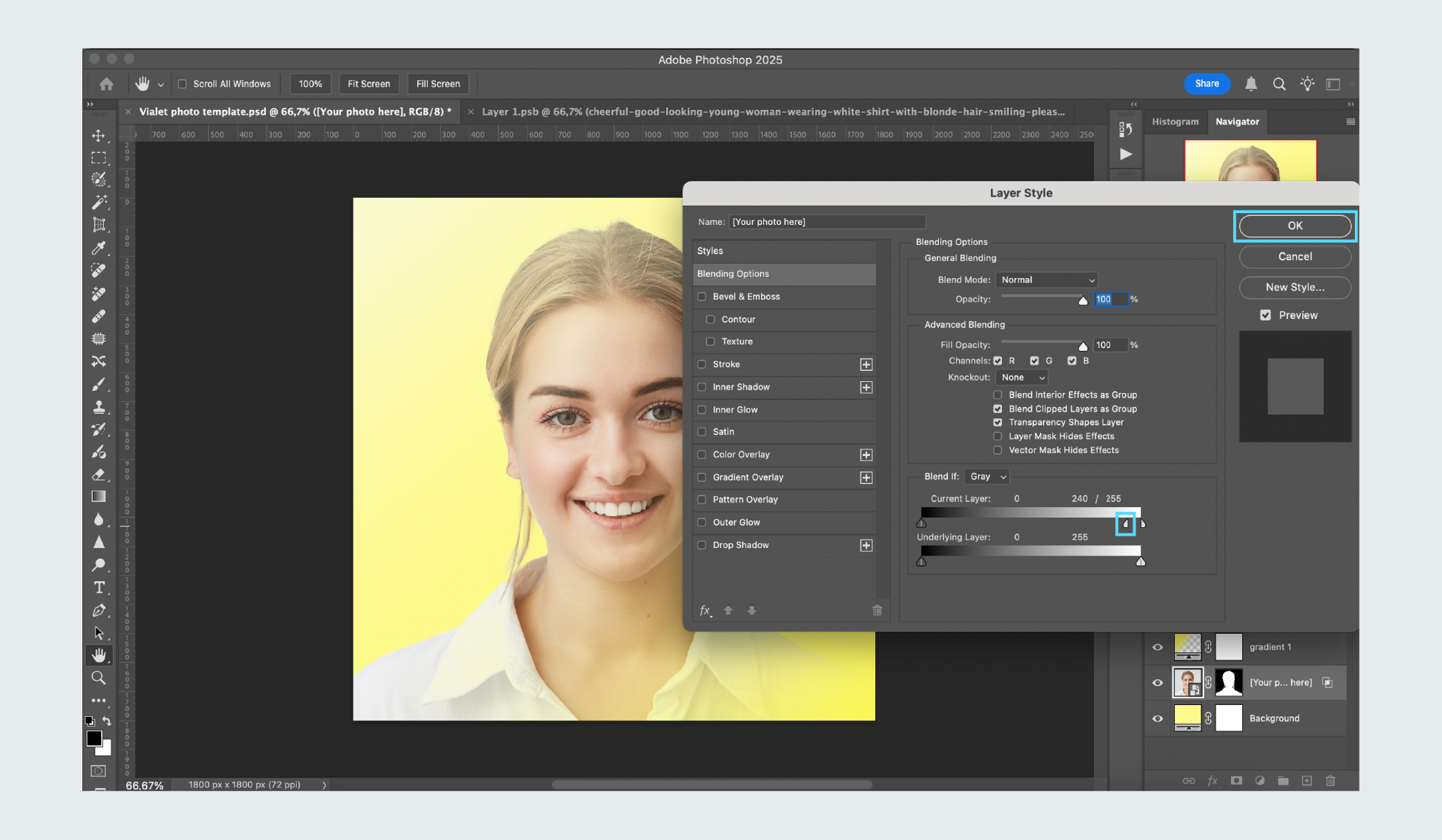 Under This Layer, move the right slider to control how much of the white background fades out. For smoother blending, hold Option (Mac) or Alt (Windows) while dragging.
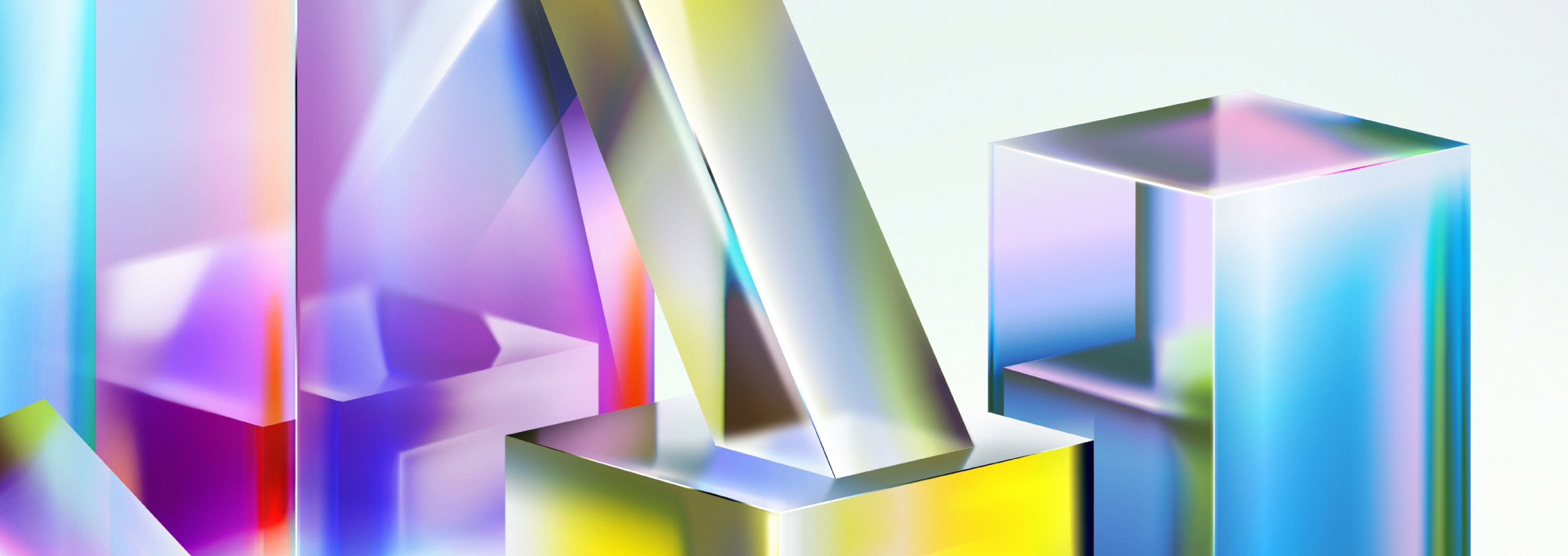
Illustrations are inspired by the prism – its light, geometry, and sense of movement – creating a flexible and visually engaging system. Clear geometric structures reflect order and precision, while flowing color transitions mirror the seamless dispersion of light. Volumetric and abstract shapes are composed in dynamic ways, often zoomed in to reveal depth, texture, and the interplay of form and color.

We don’t use the full illustration as a single image – instead, we crop and zoom into different sections to create multiple compositions from one large artwork. This approach allows for variety and flexibility while maintaining a consistent visual style.
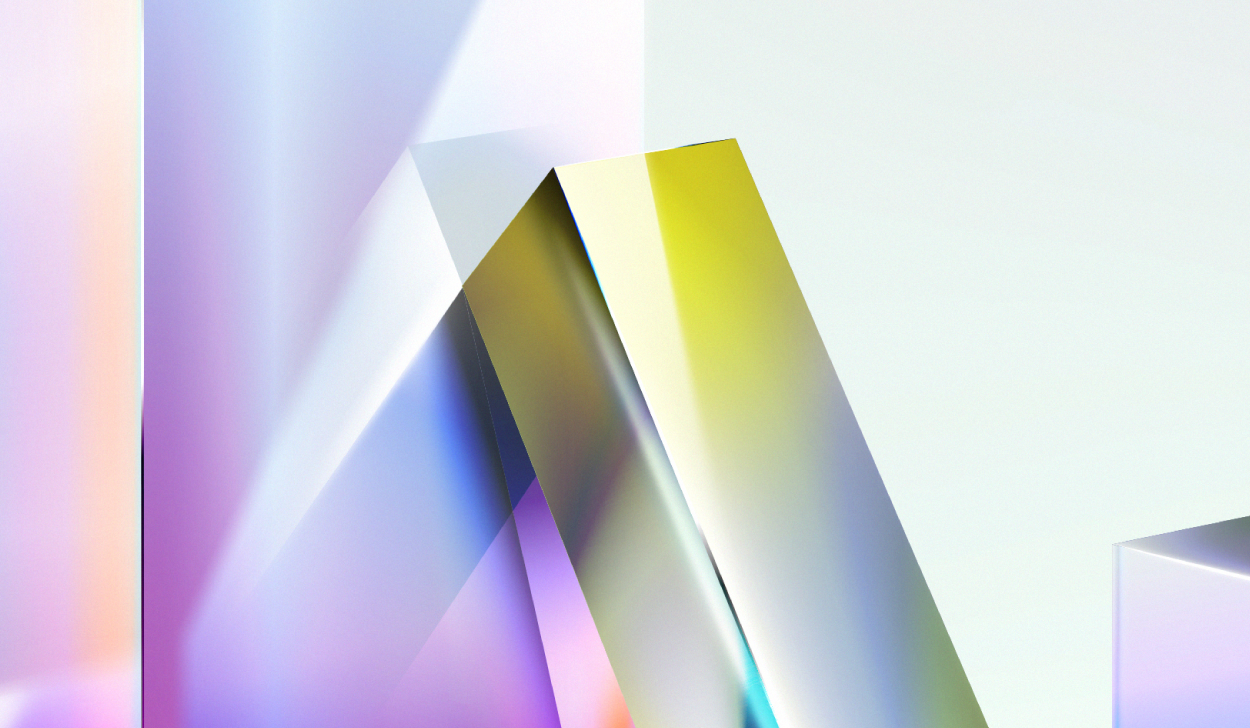



We avoid using illustrations in ways that distort their context or impact. Over-zoomed sections can make details unrecognizable, causing the viewer to lose the intended meaning. Over-zoomed out views, showing almost the entire artwork with only a small area emphasized, dilute the focus and weaken the visual effect. Maintaining balance is key: the composition should be close enough to highlight important details without losing context, or cropped enough to emphasize the main scene without showing too much at once.
-
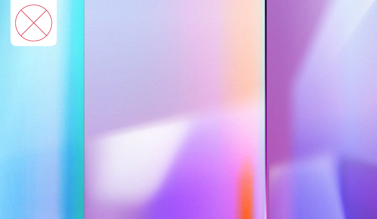 Lost context: too zoomed in
 -
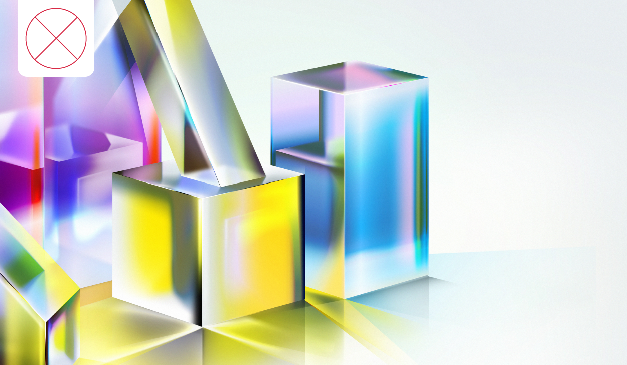 Lost context: too zoomed out
 -
 Lost context: too zoomed out
 -
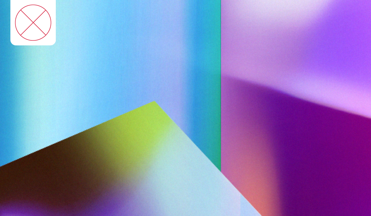 Lost context: too zoomed in
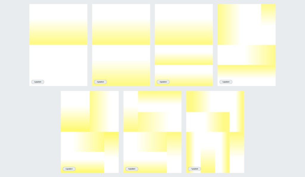
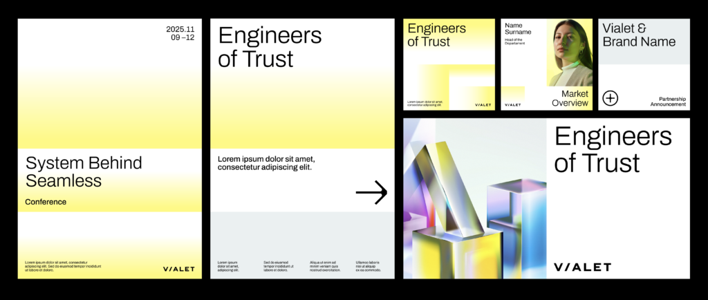
Gradients play a key role in expressing the brand’s sense of clarity and transformation. Inspired by light dispersion, they integrate yellow – our primary accent color that symbolizes light – into seamless transitions conveying depth, transparency, and energy. Each gradient functions like a puzzle piece on the artboard, and up to seven yellow gradients can be used in a single composition. The goal is to represent light refractions, arranging gradients to create varied angles and intensities of light, evoking the way light splits in a prism.
In addition to yellow gradients, a secondary grey color version is occasionally used. This variation introduces subtle contrast while maintaining alignment with the brand’s cohesive visual identity. Gradients can function as backgrounds or as standalone graphic elements. When applied consistently and with restraint, they bring unity to the brand’s visual language while preserving a vibrant, contemporary aesthetic.
Download VIALET gradient examples

From single to multi-gradient compositions
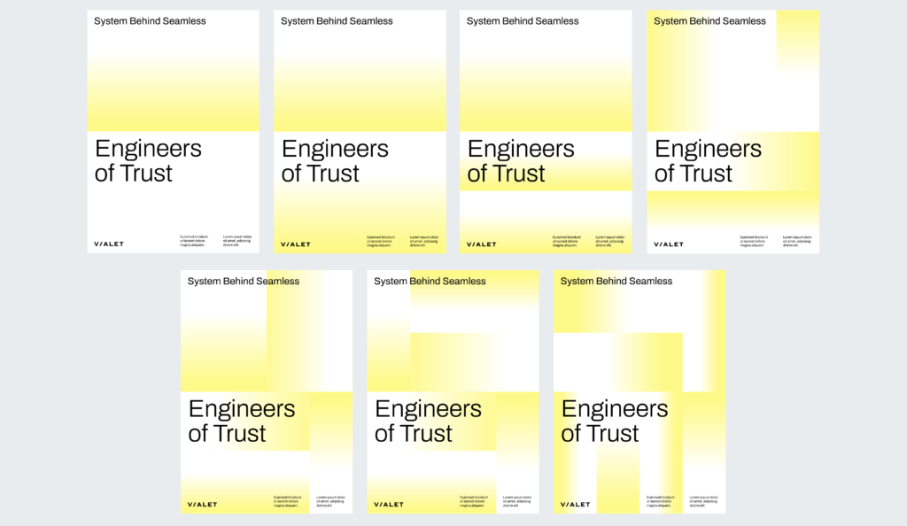
Examples of using gradient backgrounds with information – demonstrating how the same content can appear differently depending on the gradient applied.
Our icons reflect the precision and structure of the chosen typography. Their geometric, engineering-inspired forms express the systematic approach behind our strategy and create a cohesive visual identity.
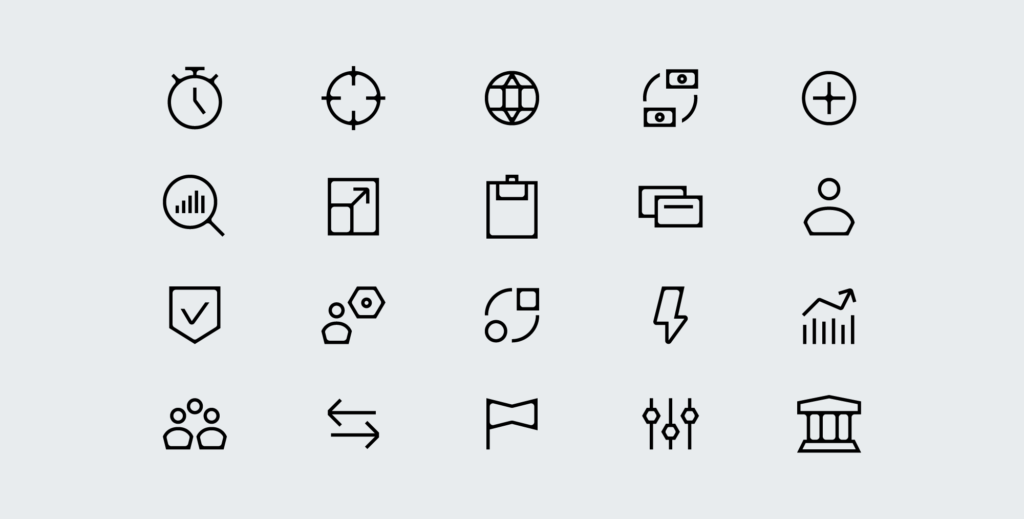
Icons are used exclusively in monochrome to maintain clarity and consistency across all applications.
-
Use black (#000000) on light backgrounds (#FFFFFF)
-
Use white (#FFFFFF) on dark backgrounds (#000000)
No additional colors, gradients, or effects should be applied.
-
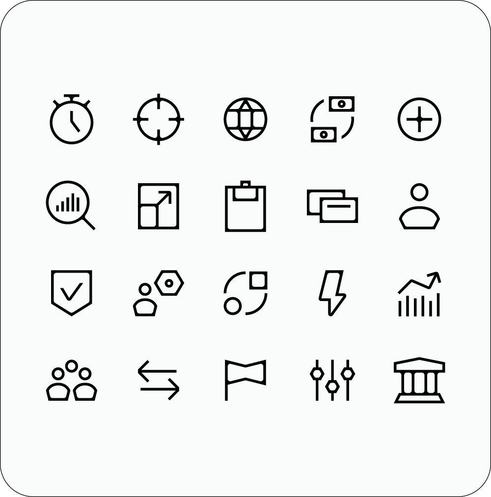 Light mood
 -
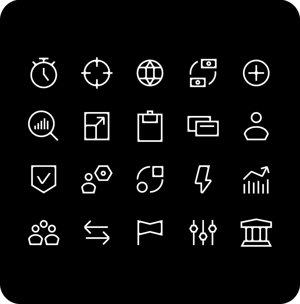 Dark mood
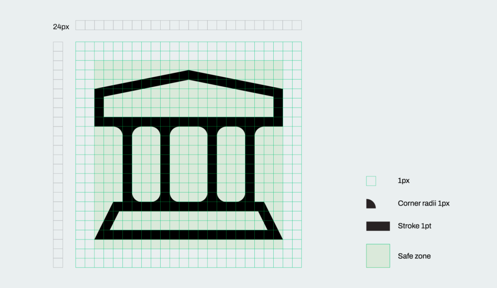
If you need to create additional icons, always follow this construction logic to maintain consistency across the system. Icons are designed on a 24 × 24 px artboard and must remain within a centered 20 × 20 px safe area. A consistent 1 px stroke is used across the entire icon set. Corner radii are limited to 1 px or 0.5 px, with the smaller radius applied when a softer rounding is needed. Rounded corners are generally kept inside the shape, balancing precision with subtle softness to maintain an engineering-driven aesthetic. Circular elements should be sized at 17 × 17 px, while icons based on larger square forms should follow a 16 × 18 px proportion to ensure consistency across the system.
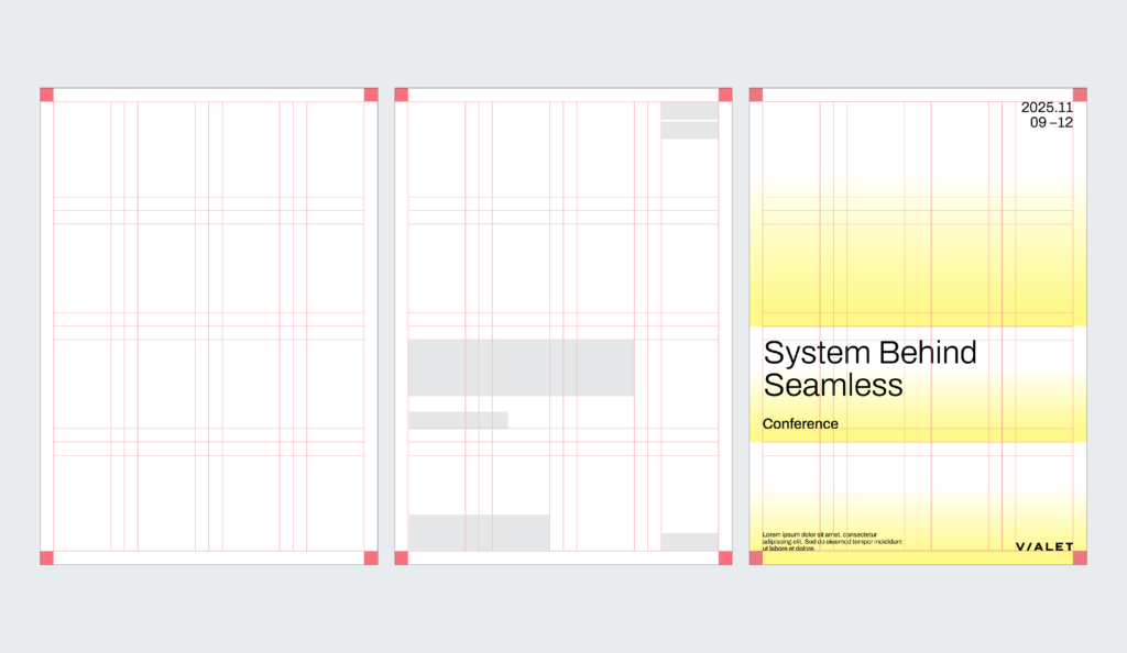
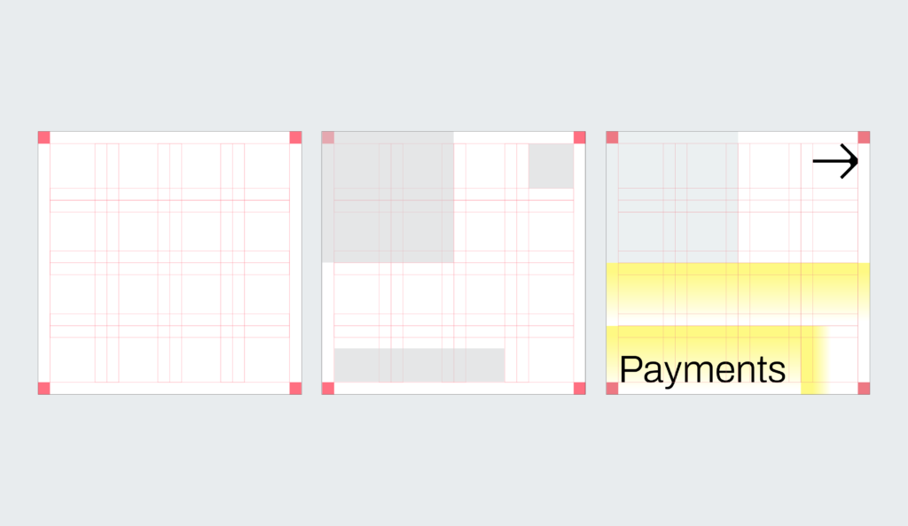
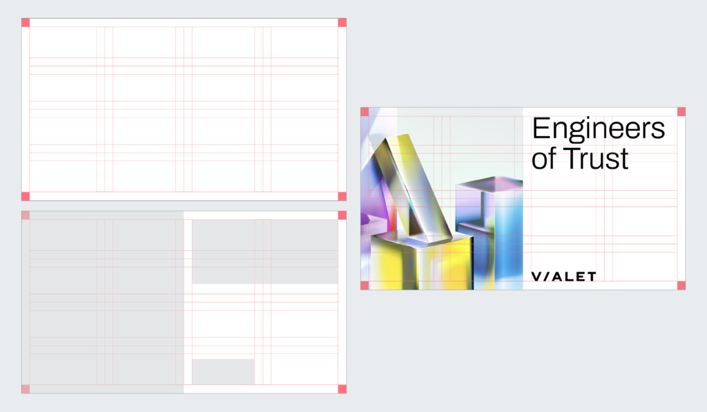
The layout system uses a four-column grid applied both horizontally and vertically, providing a solid compositional framework. Within this grid, images, text, illustrations, and graphic elements can be freely arranged. The grid employs double margins both horizontally and vertically to ensure consistent, equal spacing throughout. When using gradients, photos, or solid color blocks, elements are aligned to the centers of these margins. Text blocks, on the other hand, are aligned to the centers of the resulting grid squares. This flexible structure allows for dynamic and diverse layouts that maintain visual balance while accommodating a wide range of content—from bold, expressive designs to clean, minimal compositions.
In this example of a vertical layout, we start by creating a four-column grid applied both horizontally and vertically, with double margins. We then decide where to place the text content and determine the combination and density of graphic elements, such as gradients.
In this example of a square layout, the composition consists of three main components: a solid grey block, a white space with an icon, and a gradient composition combined with text. We start by creating a grid with double margins, applied both horizontally and vertically, and then arrange these components within the grid.
In this example of a horizontal layout, we start by creating a grid with double margins, applied both horizontally and vertically. Since this layout uses an illustration (or a photo), we decide how many grid cells it should occupy, as well as the positions of the headline and the logo.
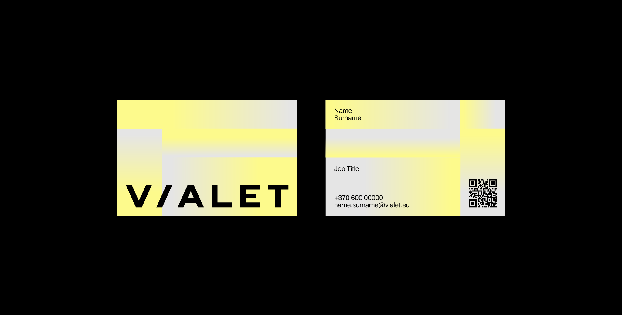
We design our business cards using the official template to ensure consistent branding and professional presentation across all team members.
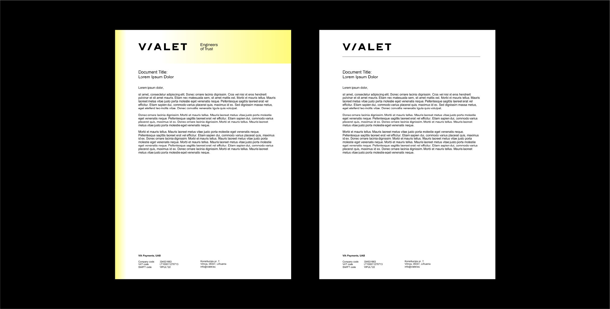
All documents should follow the approved template to maintain a uniform layout, typography, and brand identity in every file we produce.
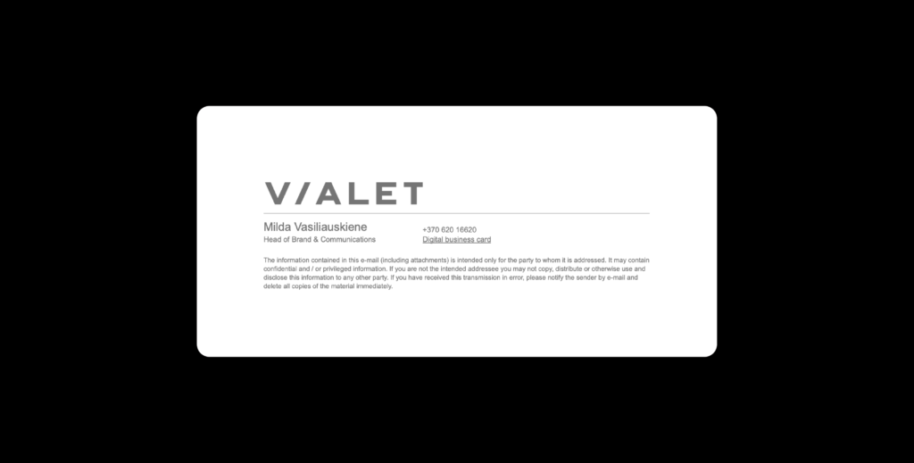
We conclude each of our emails with a signature. To maintain consistency, use this signature template, which includes key information and our logo.
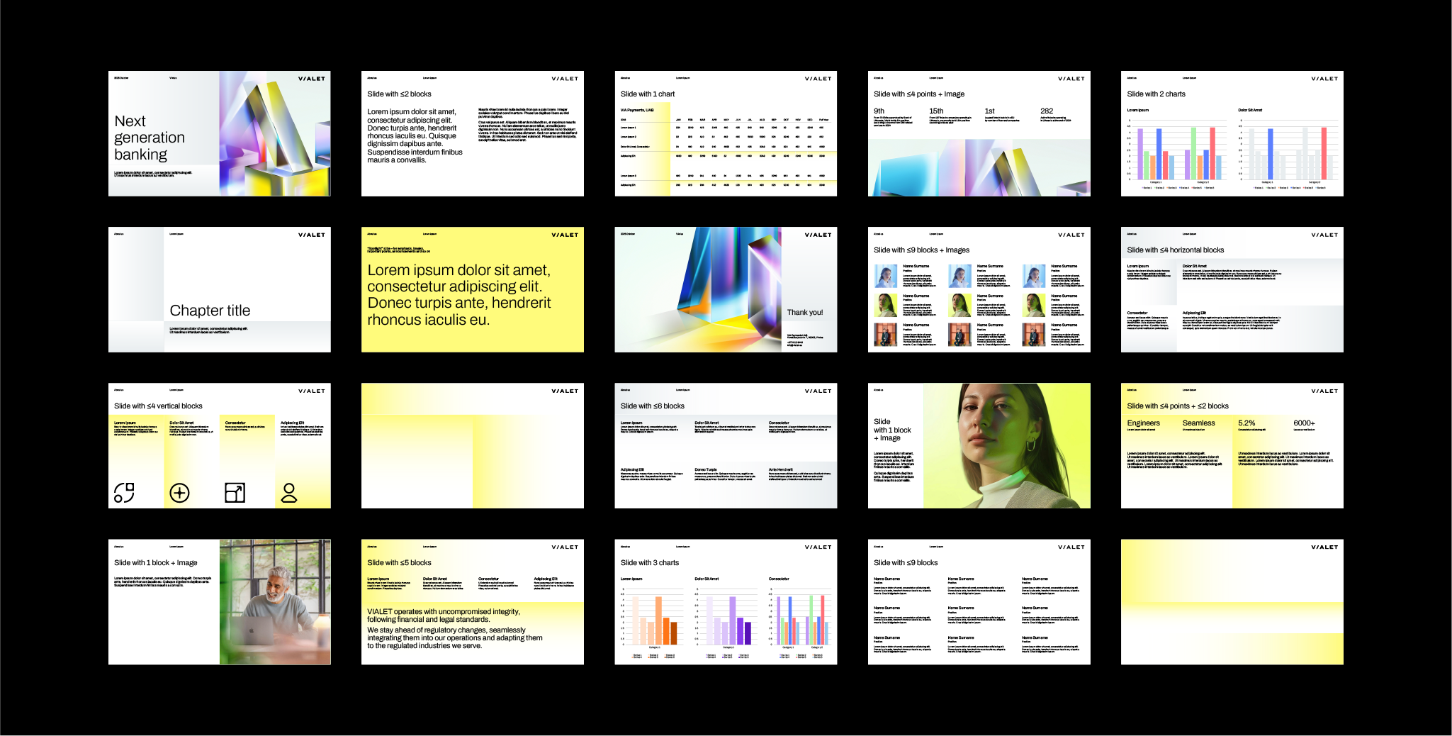
Presentation template is one example of our stationery offerings. Explore the examples below to see more of our brand materials.
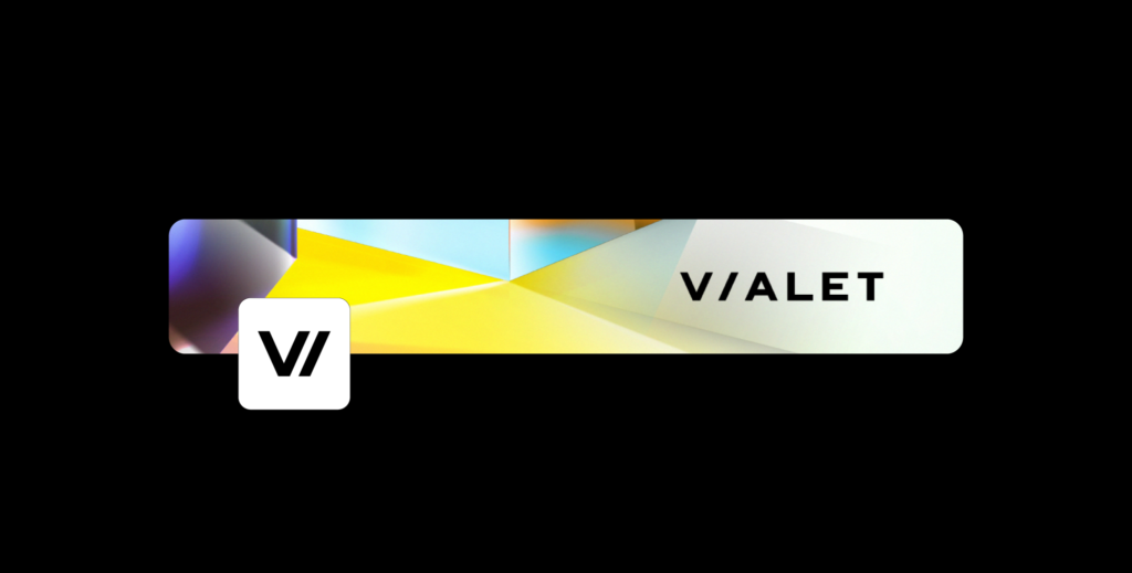
We apply our official cover and profile image templates on LinkedIn to ensure a consistent and professional brand presence.
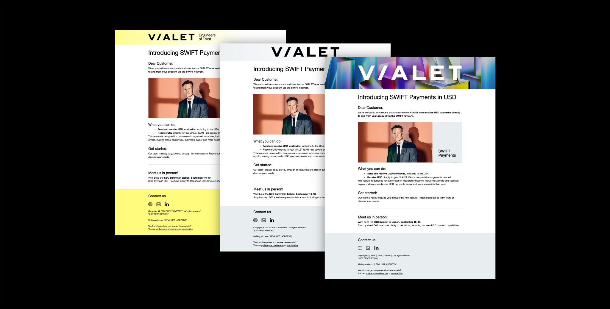
Three different newsletter templates are ready to use directly in the Mailchimp platform.
Animated banners extend the graphic system through a moving gradient pattern. Motion is subtle and continuous, adding depth and energy while preserving clarity.
Two 16:9 banners are used – one horizontal and one vertical. In animation, text placement and scale can be used more freely and is not restricted by the static grid and text rules defined in the brandbook.
Horizontal 16/9 animated banner preview:
Looping gradient animation without text, created in horizontal and vertical formats.
Download graphic element animation
Horizontal 16/9 animated graphic element preview:
